
I recently posted about Marisa Kashino’s dark comedy novel Best Offer Wins. The unhinged protagonist drives the plot, but behind her actions is real anxiety about how competitive the housing market has gotten after the pandemic. In this article, I will use publicly-available data to understand this better.
First, how much worse did the market get after the pandemic? The simplest approach is to just look at median house sales prices over time, and Zillow publishes this data online in an easy to access format1.
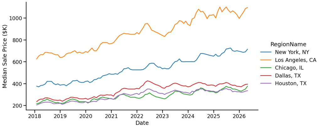
This looks bad, but it doesn’t tell us much about the competitiveness of the housing market. In fact, the biggest contributor to the growth of prices here is probably just inflation. Let’s roughly correct for inflation by using the Consumer Price Index (CPI).
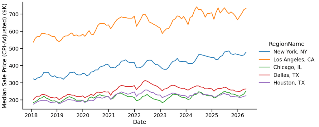
This plot is now a lot flatter but still not very informative of competitiveness. We can see the Dallas market (in red) may have reached a peak in 2022 and fallen afterwards, but Chicago and Houston stay flat while New York and LA show steady growth.
I think the best way to check competitiveness is to look instead at the sale-to-list-price ratio. This number tells you how much a house sold for compared to the listing price. For example, say a house is listed for $500K but ends up selling for $510K. The ratio in this case is 510/500 = 1.02. The higher this ratio is, the more likely that buyers competed for the same supply and drove up the sales price. It’s not a perfect measure because sellers should respond by increasing their listing prices, bringing this ratio back down. Thus, high or low sale-to-list-price ratios indicate temporarily hot or cold house markets.
To make it easier to visualize, I will express this number as a percentage difference. In the example from above, we would get (510 – 500)/500 = 2%. Let’s use Zillow’s data to plot the mean percentage difference over time in the same housing markets:
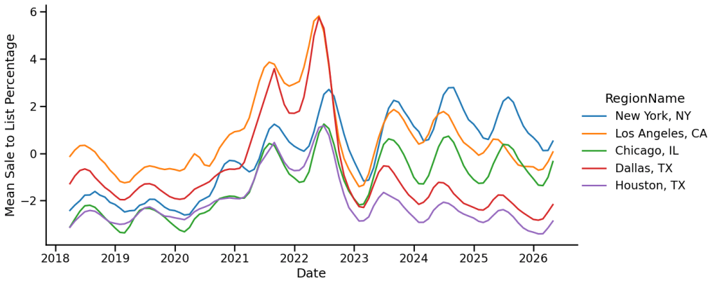
You can clearly see a big jump towards the end of the pandemic, with houses in Dallas and LA selling for about 6% higher than the sales price! Interestingly, as soon as we reach 2023, this market turns cold again, with sales prices close to or even below the listing price. We also see that Dallas and Houston both shift to a very cold market, with houses now going for about 2% below list price. In contrast, LA returns to pre-pandemic market levels while New York (which did not heat up as much as the other markets) continues to stay a warm market.
To corroborate these trends, we can look at another indicator of market competition: all-cash offers. Rather than take out a loan, these buyers are willing to front the full cost of the house. This option moves the risk from a bank to the buyer, but sellers also prefer all-cash offers since they reduce the risk of the sale itself. Thus, increases in all-cash offers reflect a hot market. Redfin’s data2 shows that all-cash offers increased steeply after the pandemic, jumping from about 25% in 2019 to a peak of 35% at the end of 2023, but have declined to normal since then.
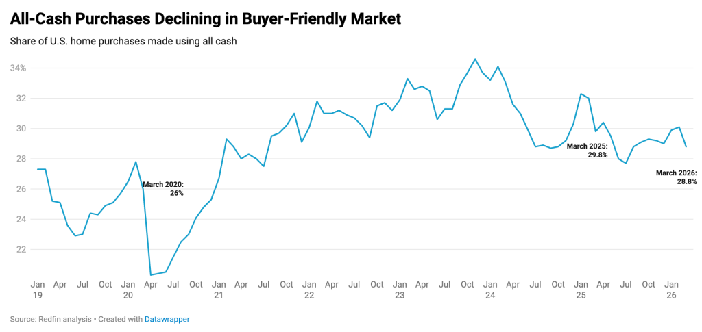
The data creates a cohesive story about the housing market after the pandemic: the market got hot, especially in places like Dallas and Houston, immediately after the pandemic. Buyers ended up spending more on houses, even as house sales prices continued rising. Starting around 2023, the market cooled down in places where it had gotten warm. Overall, housing prices have mostly kept pace with inflation except in a few special places like New York and LA.
To tie up this last loose end, what makes these places special? The economics literature suggests that in these areas, housing supply (i.e. increasing the number of houses by construction or renovation) cannot increase fast enough3. As a result, sudden changes in housing demand due to things like a world-wide pandemic or an increase in mortgage rates adjust housing prices for longer and more strongly.
A brief side note on cause/effect:
The story above suggests that people moving to a city cause the housing prices to rise. This argument is causal: I am stating that population movement causes increased housing prices. One way we can test this hypothesis is using time: if people moving to a city causes increased housing prices, then we should see the population growing first and then the housing prices grow. This analysis is called Granger causality, and we can use the Zillow dataset along with Census data4 giving the population of cities over time to test our hypothesis.
Intriguingly, in my analysis I can only find evidence for the reverse hypothesis: generally, if the median house price increases, the population will grow larger after a year. This effect is very small: if the median house price doubles, then the population will only grow by about 2.5% on average over the next year, but the effect is statistically significant. On the other hand, population growth clearly doesn’t seem to predict or precede median house price changes.
There are a few options for why the causality goes this way: maybe house price growth generally reflects economic growth, which then leads to people moving in? Or maybe the house price data reflect expectations of how good a region will be soon, and later on these expectations generate economic growth and population growth? To tell these apart, I included local GDP data from the Bureau of Economic Affairs5 to test which model fits the data best.
Again, I found the counterintuitive result that home price increase seem to precede and predict both population growth and GDP growth. In fact, home price increases have an even stronger effect on GDP growth compared to population growth: if the median house price doubles, then the local GDP increases by about 5% on average over the next year. Thus, these results suggest that house price changes precede and predict both local GDP growth and population growth. Perhaps then house prices really tell you about what people think the local economy will be like in a few years. After all, purchasing a house is a bet a person is making about the area – that it will continue to be a good place to live for many years afterward.
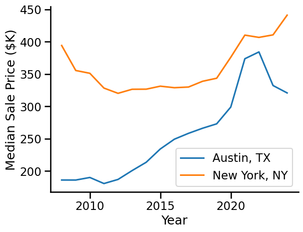
Just for fun, what does our model say about which cities are going to have large increases in local GDP based on home prices? Looking only at big cities with more than 200,000 people, the top three are New York, LA, and Milwaukee. The city predicted to do the worst? Austin, TX.
- An excellent resource: https://www.zillow.com/research/data/ ↩︎
- See https://www.redfin.com/news/all-cash-homebuyers-march-2026/ ↩︎
- An article in American Economic Review https://www.aeaweb.org/articles?id=10.1257/mac.20190011 ↩︎
- See here: https://www.census.gov/data/tables/time-series/demo/popest/2020s-total-cities-and-towns.html ↩︎
- CAGDP1 from here: https://apps.bea.gov/regional/downloadzip.htm ↩︎

